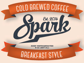
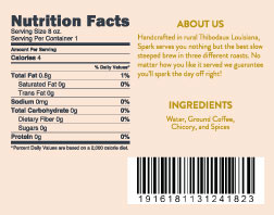
My first packaging project project that focuses on typographical hierarchy when creating a design. The vintage look and colors used is meant to instill a more homemade feel in the viewer.
The final production of the three bottles.
Join Behance
Sign up or Sign into view personalized recommendations, follow creatives, and more.
or
Join Behance
Sign up or Sign in to view personalized recommendations, follow creatives, and more.